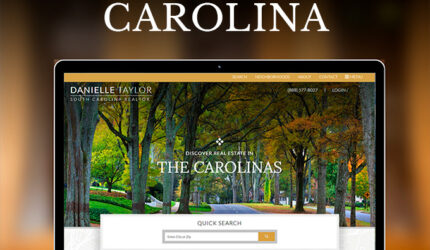
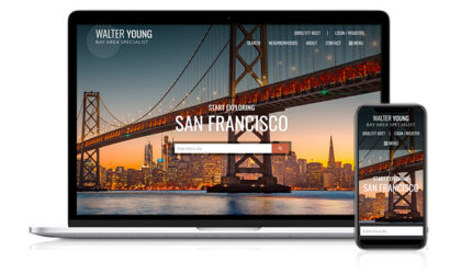
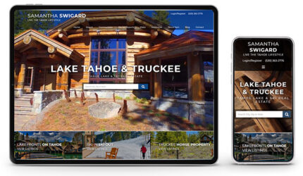
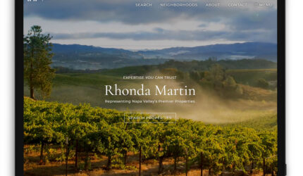
Where To Get Quality Photos

July 20, 2008 by Esther  

You have spent the money and time to get a website developed that gives you a professional appearance…so take the time and add photos that show your attention to detail and professionalism. Sure, you can surf the web for 20 minutes (or more) and try to find images you can legally use on your site for free, but we would suggest getting an account with iStockPhoto. iStockPhoto has a very large collection images that you can search by keywords and typically cost $1 for you to legally use on your site. The time you will save alone is worth the cost and the site is easy to use.

The following are stock photograpy sites that professional web and print designers say offer “the best selection” of images are :Stock Photography Sites

Other sites designers feel offer photos for “the best value” are :

Once you have your photo, be sure to check out our tutorial on using Picnik to help put a professional drop shadow or edge effect on it to make it pop!

Keep in mind, you don’t want to just use any photo you find on the web without getting permission first. In general, using images from another website without permission is illegal.

If you enjoyed this post, make sure you subscribe to our RSS feed!

Making A Great Impression With Your Images

July 20, 2008 by Mark  

Photo Editing ProgramWhen adding images to your site, take the time to make sure the images you post reflect the professional image you want to convey to your visitors. One free web based application that makes this possible, with ease, is Picnik. Picnik will allow you to resize, optimize for quick downloads, add cool effects, drop shadows, frames and so much more. With just a few clicks of your mouse you can have great looking images that won’t take forever to download and frustrate your visitors.

Note: If you do find yourself using this tool often, as we believe you will, please consider paying for their premium service (only $24.95/year) to help support the program and ensure it stays around.

If you enjoyed this post, make sure you subscribe to our RSS feed!

Don’t Overuse Font Styles, Sizes and Colors

July 11, 2008 by Esther  

When writing your posts try to keep in mind “less is more” and you want to make your readers experience an enjoyable one. Nothing confuses a reader and turns them off more than an overuse of different fonts syles, sizes and colors. If you have something that truly needs to stand out, then simply bold it or place it in quotes. Try to stick to one or two font families and use only the italic and bold version of the font when needed. Consistency is key! Stick to the same pattern when using your fonts i.e. a bold title, italic the subhead (if you have one) and use regular text for the body. Avoid underlining text, as this may confuse the reader into thinking it is a link to another page. Learn by example. Look at other sites that you feel offer a good user experience and study their pattern of use when it comes to fonts, colors etc. If you don’t like what you started you can always go back and change it, but starting off on the right foot first will save you a lot of headache in the future.

Things to consider:

  • Stick to one or two font families.
  • Stick to one or two complimentary colors.
  • Keep in mind, consistency is key and less is more!
  • Avoid underlining text. This may lead the reader into thinking it is a link to another page.

If you enjoyed this post, make sure you subscribe to our RSS feed!